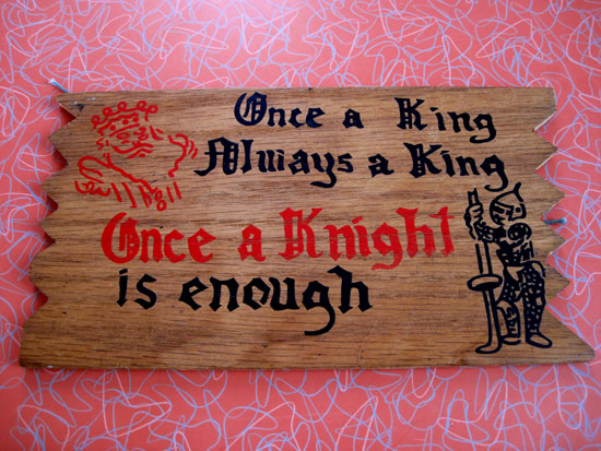
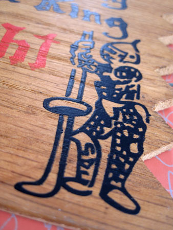
This is a very sloppy version of the kind of ‘sexy’ joke signs that became popular around the early 1960s and hung in many a wood paneled rec room somewhere in the vicinity of a ping-pong table and beer keg. I especially love this one because the Knight looks more like a Harlequin getting ready to play hockey.
I also love how completely off center all the text is:
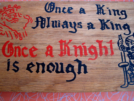
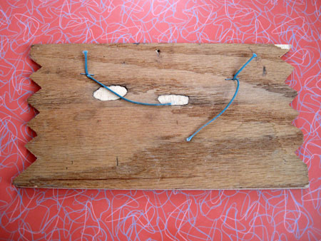
The two ‘King’s line up but ‘Always’ juts way out to the left. A decent art director would have centered these two lines. The same goes for “Once a Knight’ and ‘is enough’. But off-center and Knights that look like Wayne Gretzky is exactly what this kitsch lover looks for in a sign. The two eyeballs on the back don’t hurt it either.
