


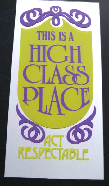
These smart-aleck signs that one sees in small businesses, restaurants, bars, etc. really make you wonder: does anybody REALLY find them funny? This one has its bold purple and avocado green graphics on a mirror (hence the odd angle above to avoid the flash in the photo) which doesn’t make a whole lot of sense since so much of the surface is covered– the mirror kind of loses its function.


Allee Willis
My favorite thing, as you point out, is that there doesn’t seem to be much room for the mirror…
I usually hate mirrors that have stuff written on major portions of them like so many beers signs do but this one goes wayyyyyyyyy to the extreme, leaving little to no surface for the mirror itself, that it jumps up into a high realm of Kitsch for sheer ineptitude on the part of the designer.
How big is this?
Do you know when this was made? From the font I’m guessing 70’s or even early 80’s?
Douglas Wood
It’s about 6″ x 11″ and yes, my guess too is that it’s from the early 80’s.