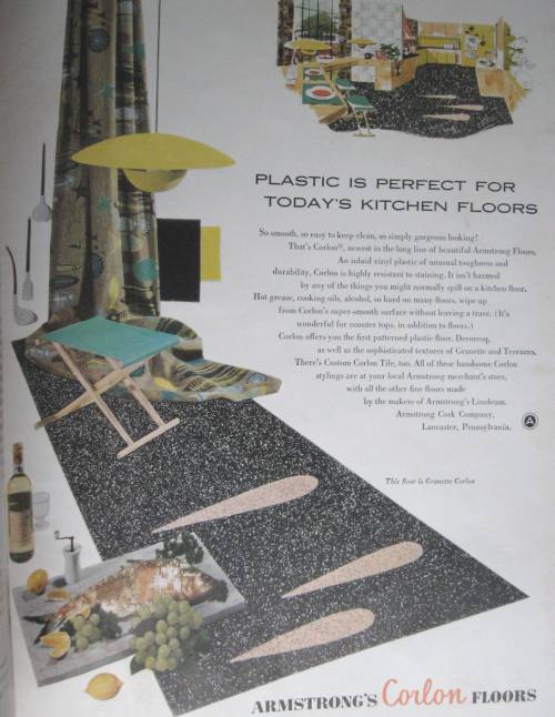
 Along came plastic flooring in the mid 1950’s. This “Better Homes and Gardens magazine” changed the way the “modern” family decorated forever.
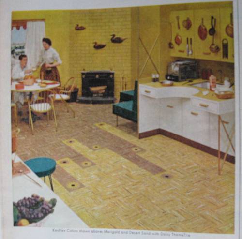
Run out of one color tile…no problem? The open floor plan? just change the color of the flooring. The design tiles created a blend. What that cut out counter design element by the sink? That never caught on did it. Are those pots and pans hanging on the cupboard doors? That never caught on either.










Allee Willis
Gorgeous, gorgeous, gorgeous, especially the pattern in the 1st photo. Not that I would throw any of this off of my floors, two of which are thankfully linoleum murals.
I don’t know why customizing linoleum floors ever went out of style. It’s not like it’s that much more expensive unless you’re going to get into an intricate design like I have here at Willis Wonderland.
The fireplace and the wall-mounted ducks in photo number 2 are killing me. But what I like even more are all of the pots and pans hanging on the cupboard doors. I can’t even imagine the racket when the doors open, although I’m 99% sure that’s a fake kitchen.
k2dtw
LOVE the floors!!!
MyFunCloset
#1 photo actually looks like today’s counter top.
I just knew you’d love these floor designs. Your personal floor insert blocks are far beyond what they could dream up.
Way too much yellow… but then again, that was 1955.
100% fake for sure.