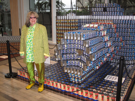
I’ve always been intrigued with label design, especially when appearing on cans, as the designer has to take the roundness into consideration as well as the inescapable fact that only a portion of the design is going to be seen at any one time. But then imagine having to stack the cans so they become something else. The label still needs to retain its power but must also give power to whatever structure you’re using it to make. This weekend I had the honor of judging and announcing the winners at the Los Angeles Canstruction awards, a design contest that takes place in over 100 cities where designers compete using canned food as the building blocks to make a variety of giant objects. After the contest, all of the food is donated to local food banks, so the quality of the meal provided in each structure is a very important criteria in judging its worth.
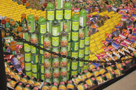
At first glance it might look like someone just plopped a bunch of cans on top of each other, but the four categories each object is judged on speak to the intricacies of building such a design. There’s also a winner in each individual category.
1) STRUCTURAL INTEGRITY – This is a killer category because all structures must be self-supporting. You can’t use 2×4’s or anything over half inch plywood to support the cans. The only materials permissible are quarter inch or less foam core or plywood, cardboard, Masonite or plexiglass, and those can only be used for leveling or balancing and not for load-bearing. As far as attaching things to each other, you can only use Velcro, clear and double sided tape, rubber bands, fish wire, wire, plastic ties and magnets, none of which can be visible. And absolutely no glue is allowed. So these things are really feats of engineering.
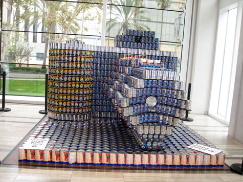
The winner in Structural Integrity category was “Cancave/ CANvex”, built by HMC Architects and Buro Happold Engineers. This structure used none of the aforementioned items to hold it together but rather, each row of cans was supported by the weight of the next to hold together.
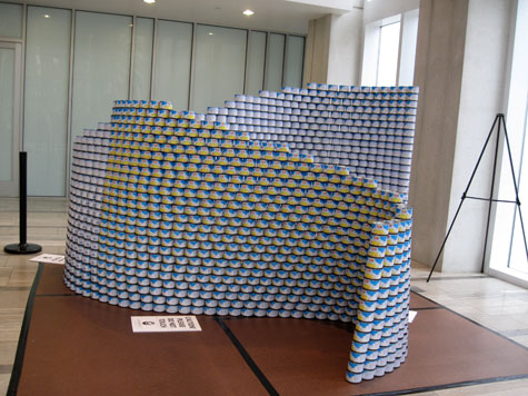
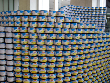
The wave, however, was a little light on nutritional variety. It consisted solely of cans of Dole pineapple.
2) BEST MEAL went to “Not So Hungry Hungry Hippo” by RTKL Associates.
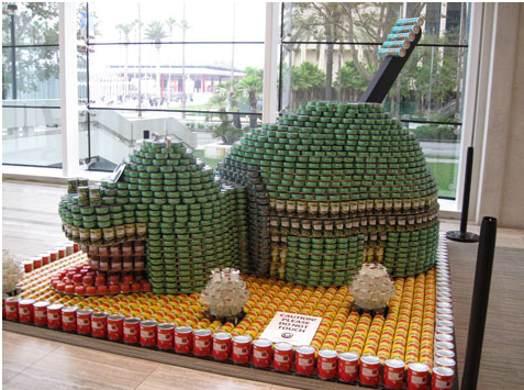
The hippo included lights and had the most appetizing collection of food: whole peeled tomatoes, cut green beans, mixed vegetables, ravioli, tuna, lychee jelly and Pringles.
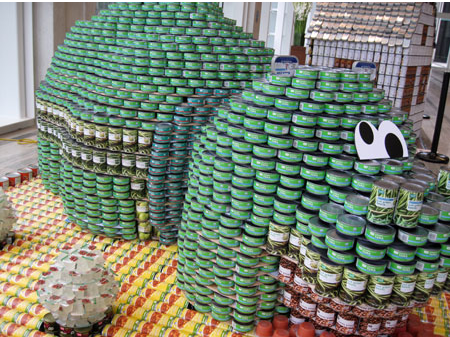
3) BEST USE OF LABELS – The most creative use of graphically strong labels went to “CANucopia” by Perkins & Will.
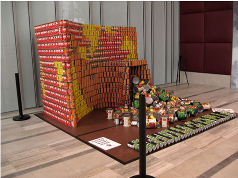
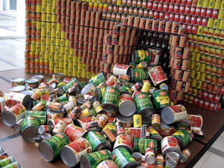
It’s hard to see from the angle of that photo but brown cans of crushed tomatoes formed the shape of a cornucopia that food including my favorite, pork ‘n beans, spilled out of.
4) JUROR’S FAVORITE – This award went to the canstruction that best combined all of the above categories. The winner was “Can-on, Picture a World without Hunger” by Gensler and Arup, a giant Canon camera built out of black beans, peas, green beans and tomatoes. This design was really intricate. As I rely so much upon my Canon Elph to capture the images I feature every day here in Kitsch O’ The Day, I can tell you they got every little feature on the camera.
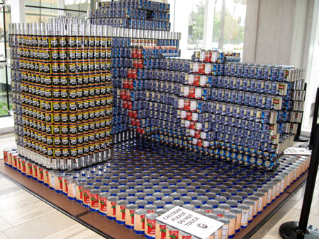
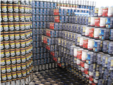
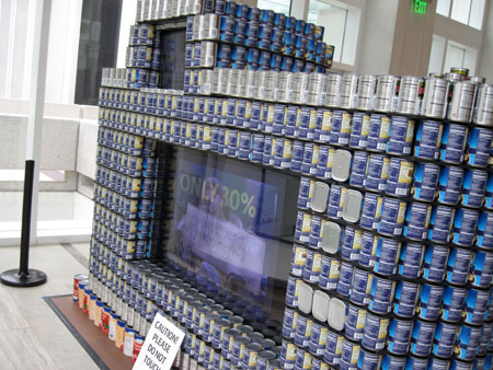
The structure also integrated technology. Two screens featured a live streaming video of people looking at it as well as a presentation of images of people who will benefit from the food donations.
I don’t have that many vintage cans of food in my Kitsch collection. Of the few that I have, I’m most attached to my canned ham and my can of Popeye’s Spinach.
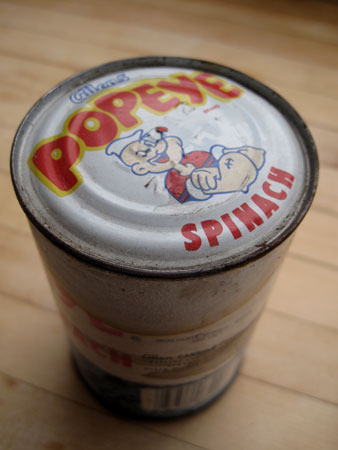
I had two cans of Popeye’s but used one in 1988 in my motorized art piece I built to match my song sung by Pet Shop Boys and Dusty Springfield, “What I Done to Deserve This?”.
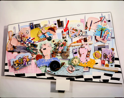
This piece is over 9 feet long and weighs close to 400 pounds. That’s because of all of this on the back:
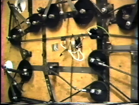
You can actually see it moving here. You can see a nice close-up of the spinach can here. You can see everything you’ve ever wanted to know about the art and music of “What I Done to Deserve This?” here. But this post is about cans of food, not motorized pieces that I only have really crappy photos of. And it’s certainly about cans of food that held up better than the Popeye’s can I still have.
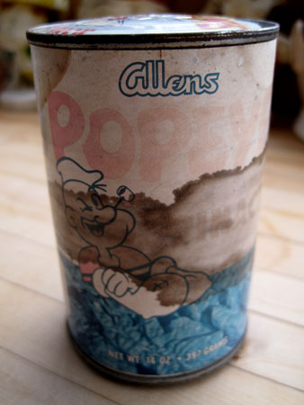
I have to assume that it’s the spinach itself that seeped through the tin and attacked the label. When you pick the can up it’s packed so tight the lids are convex at both ends. I know that’s not the way the spinach originally came when it was made back in the 1960s or 70s as I found this photo on the web of someone who actually measured how much spinach Popeye was packing. A full third of it was liquid.
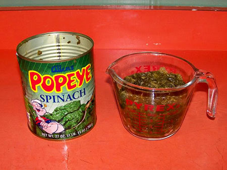
I’m confidant that the food making up the Canstruction entries was all nice and fresh and not the kind that could blow the roof off of your house.






denny
This was fantastic!
By the way, your feet are looking gorgeous.
Allee Willis
Thank you! I was particularly happy with my feet that night.
MyFunCloset
Putting the can designs on paper is one thing, but then the construction …outstanding! Love the Cancave/Canvex and how the labels were used. Your collage is worthy of MOMA …don’t you think?
Allee Willis
Yes, MOMA!
Mark Milligan
Allee where was this, and are they still on display?
That’s fantastic!
Allee Willis
I think they’re on display for at least a couple of weeks. In the lobby of 5900 Wilshire, directly across the street from LACMA.
Douglas Wood
Amazing!
StoryTroy
I’d seen a similar enormous “wave” display made of Coke/Diet Coke last year at the NoHo Hows Market (across from AI)… broke my heart to see folks lifting their six packs off of it.